Thursday, October 24, 2013

Map: King of Beers

Beer of Choice Map - Blowfish


This map has been making the rounds on different media sites, but it's still pretty fun. According to Blowfish (maker of the map), Budweiser can no longer claim the title "King of Beers"-- instead, that title belongs to Blue Moon. Of course, what interests me the most isn't the most popular national beer, but rather the regional trends in beer preferences. Click over to Slate to learn more. 
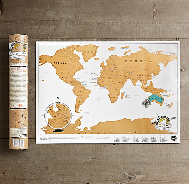


Cool Stuff: Mini Scratch Map

Mini Scratch Map - Restoration Hardware


How fun is this mini scratch map?


Wednesday, October 23, 2013

Mapping Music: Bob Dylan

Place Bob Dylan Sang About - Bollier, Kirk, and Kreitner


Some writers at Slate created this great map with a marker for every place ever mentioned in a Bob Dylan song to mark Bob Dylan's 72nd birthday. Click over to the original article to explore all of the places!


Note: I will be creating my own maps soon- my work has just been delayed due to the government shutdown that temporarily made all census data unavailable.


To Watch: Time


This film is a compilation of the amazing comic, Time, a 3,099-frame comic that played out over the course of many weeks, with a new panel revealed every half-hour. As xkcd creator Randall Munroe explains in this blog post, the story is set thousands of years in the future during a unique geologic event in the Mediterranean Sea. I highly recommend watching the whole film and reading the post about the careful research and beautiful artwork that went into creating this unique piece.

Tuesday, October 22, 2013

To Read: The Problem with Rankings

Ranked States - Mikey Burton


This is a quick read, but a very worthwhile reminder: Don't take state rankings at face values. As a nation now obsessed with data, it's time to talk a bit about methods. Comparing diverse populations can lead to wildly misleading results. As this short article in the Atlantic shows, there can be many behind-the-scene confounding factors that contribute to a seemingly interesting statistic.


Monday, October 21, 2013

Maps: Civil War Slavery

Slave Population in the Southern States - Library of Congress


This beautiful, historic map was a favorite of President Lincoln, who studied it in great detail during the American Civil War. The map is shaded according to the number of slaves living in each county, and Lincoln found that the darker areas also corresponded to high levels of secessionist attitudes. However, as he saw and we now can see, the South was far from monolithic in its number of slaves and attitudes toward secessionism. Click over to the New Yorker to learn more about this map and the history of infographics.


Cool Stuff: Seasonal Produce Calendar

Bison Seasonal Produce Calendar


This seasonal produce calendar by Bison is quite lovely


Thursday, October 10, 2013

Cool Stuff: Travel Notebook

Travel Notebook - Wit and Whistle


I love this notebook from Wit & Whistle

Map: From ISS


Guess what this is?

It's every photo taken from the International Space Station, plotted. Which is pretty awesome if you ask me. You can read more about this map over at Future Tense. And if you want to see some of those ISS shots, head over here (once the shutdown* is over).


*A word on that: Taking the government hostage is not the way to pass or repeal legislation in a democratic republic. Please give us back NASA, the CDC, the USDA, the Census, and all the other functions that should be happening right now.

Wednesday, October 9, 2013

To Watch: Overview


OVERVIEW from Planetary Collective on Vimeo.

This film, about viewing our earth from the outside, is absolutely fascinating and beautiful.

Tuesday, October 8, 2013

Wednesday, October 2, 2013

To Watch: Bodies on the Border


Bodies on the Border from The New York Times - Video on Vimeo.


This New York Times documentary explores the human rights crisis here along the nation's southern border. To learn more about what you can do to help, head over to No More Deaths (No Mas Muertes).


Map: London, 1890

Bacon's New Map of London Divided into Half Mile Squares & Circles


This beautiful traveler's map of 1890 London is the work of George Washington Bacon of 127 Strand, London. Bacon's New Map of London Divided into Half Mile Squares & Circles depicts the city in excellent detail, with four inches to the mile. (Bonus: This map is now in the public domain, so you can print off a copy for your own collection!)


Tuesday, October 1, 2013

Places: 32.214036,-111.101478

Grant's Pass, Tucson, AZ - Fall 2012 - K.L.H. Tanoue


Bright and clear, the moon rose overhead in the dusky sky as the rocks on the trail turned to shadows. Creatures rustled through the bushes as a pair of coyotes yipped over the nearby ridge. Your feet crunched behind me in the dusty gravel as we rushed to outrun the last lingering traces of day. Tall and silent, the saguaros towered overhead, pointing upward past the creosote bushes and the jackrabbits and the rugged buttes to the expansive desert sky as night sprang to life.

32.214036, -111.101478


To Read: Revolutionizing Food

Urban Farmers Ltd - The Atlantic


Well, it's not revolutionizing food as much as how we grow food. I hope by now that you've heard of aquaponics by now. Some of you probably know all about it. For those of you who don't, here's a short and sweet guide to aquaponics and it's urban farming potential.